Navigation
Install the app
How to install the app on iOS
Follow along with the video below to see how to install our site as a web app on your home screen.
Note: This feature may not be available in some browsers.
More options
You are using an out of date browser. It may not display this or other websites correctly.
You should upgrade or use an alternative browser.
You should upgrade or use an alternative browser.
General 2025 NZ Warriors Jerseys and Merchandise
- Thread starter mt.wellington
- Start date
I think it looks a lot better on the players than it did on that mannequin. But I still a bit meh
With the shade of green and blue they used, it kind of feels like a Moana Pasifika jersey that was rejected, and so they have just replaced the orange with red to match our colours and called it a day. Would have looked better less pastel/bolder colours, and less of a tie-die thing going on I reckon
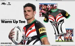
At the risk of having it seem "lazy", I think they would have been better off using the home jersey as a template and just adding designs to that, a la the Panthers Pasifika jersey:
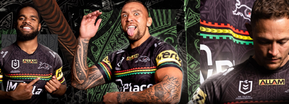

it just gives me the old vibes of having many different jerseys again. While the pastel shades may be in our colours, its really not our colours. They got it right by keeping it simple and sticking to the OG scheme but now I wonder if they are going to far again. I like the Panthers one. Its simple, effective and clearly the Panthers identity with the colour scheme. I'm sure plenty will like it and buy it though.I think it looks a lot better on the players than it did on that mannequin. But I still a bit meh
With the shade of green and blue they used, it kind of feels like a Moana Pasifika jersey that was rejected, and so they have just replaced the orange with red to match our colours and called it a day. Would have looked better less pastel/bolder colours, and less of a tie-die thing going on I reckon
At the risk of having it seem "lazy", I think they would have been better off using the home jersey as a template and just adding designs to that, a la the Panthers Pasifika jersey:
View attachment 10425
Looks like there’s a Pasifika polo shirt too looking at the instagram footage. Interesting seeing Jerry Seuseu and Brayden Williame with Albert Vete there, has Vete joined the club in some capacity?I think it looks a lot better on the players than it did on that mannequin. But I still a bit meh
With the shade of green and blue they used, it kind of feels like a Moana Pasifika jersey that was rejected, and so they have just replaced the orange with red to match our colours and called it a day. Would have looked better less pastel/bolder colours, and less of a tie-die thing going on I reckon
At the risk of having it seem "lazy", I think they would have been better off using the home jersey as a template and just adding designs to that, a la the Panthers Pasifika jersey:
View attachment 10425
Unpopular opinion… i actually think it looks pretty cool. Colours obviously tied into the One.NZ logo colours so it doesn’t stand out like dogs balls.
However I’m a middle aged white man, so probably not the target audience!
However I’m a middle aged white man, so probably not the target audience!
Unpopular opinion… i actually think it looks pretty cool. Colours obviously tied into the One.NZ logo colours so it doesn’t stand out like dogs balls.
However I’m a middle aged white man, so probably not the target audience!

2025 New Zealand Warriors Mens Pasifika Gym Short
Train like the New Zealand Warriors in our 2025 Men’s Pasifika Gym Shorts. The rich patterns from the jersey border the short’s panels representing the Pasifika legacy of the Warriors.These shorts have a sublimated design which allows or lightweight performance whether you’re kicking goals or...
 www.dynastysport.co.nz
Yeah I don’t mind it either. Like these shorts too, pricey though
Well I'm going to say it, it's a washed out pink mess. I've got less and less filter as I approach post-middle aged.Unpopular opinion… i actually think it looks pretty cool. Colours obviously tied into the One.NZ logo colours so it doesn’t stand out like dogs balls.
However I’m a middle aged white man, so probably not the target audience!
Isn’t it in another week?Did anyone go to the Dynasty sale in Auckland?
Prices were $5 - $90 on all their pro team ranges
Yeah you're right. Starts next ThursdayIsn’t it in another week?
- Thread starter
- #74
I've got one of those signed jerseys too, except I wear and wash mine
Thread for all discussion on the 2025 Warriors merchandise range. May as well get this started.
Please head to the following link if you wish to discuss anything to do with the 2024 season...

General - 2024 NZ Warriors Merchandise
This was on the old site and I can only find a NZ Herald article behind a paywall. Who will be replacing Puma in 2024?nzwarriors.com
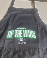
I just got my apron I bought with my membership $50. I love it, only one small gripe, I wish the print was higher up on the bib but not a biggie. The big plus is the straps are adjustable, it's one long continuous strap so you can make it sit higher up.
Attachments
Good stuff. My lad's chuffed with his drink bottle and the mrs got the little shoulder bag thing that looks like a cross between a travel bumbag and a meth pipe holder.I just got my apron I bought with my membership $50. I love it, only one small gripe, I wish the print was higher up on the bib but not a biggie. The big plus is the straps are adjustable, it's one long continuous strap so you can make it sit higher up.
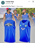
Not sure if this is the right spot but I kinda got curious about one of those adds that keeps popping up on my feeds advertising NRL jerseys for like $30.
I like having the most current jersey but It felt hard to justify getting another jersey after getting the new one last year so thought I’d have a cheeky look after hearing from some that they were ‘exactly the same’.
For those wondering- they are far from it, material is a shittier version, the blue /red and green are slightly different tones, sizing is about 2 sizes smaller and things like the logo and nrl patches are sublimated to the point where there’s a weird off shade box around the map at the back of the neck. Was that shit that I ended up getting a proper new season one as I do like the new collar and how the v is a bit shorter- plus I got a dud one this season where the collar is off centre and it bugs me enough not to wear it lol.
Moral of the story if you’ve been tempted by those ads... don’t be lol
Ah the SuperLeague get up!
-
Nobody is reading this thread right now.
Similar threads
- Replies
- 30
- Views
- 2K
- Replies
- 23
- Views
- 3K
- Replies
- 18
- Views
- 2K
- Replies
- 7
- Views
- 2K
- Replies
- 13
- Views
- 3K
